Tuesday, 16 December 2008

Article

Today i finished off my article on a real life story. As you can see the image that i have chosen to use is relevant to the text as it suggests that the celebrity cannot cope due to the problematic situations surrounding her.
The choice of colour for the headline was based upon, what would suit the article best and what colour would stand out, given thought to the image as well.
I chose to use (Bononi MT Black) because it adds more effect to the story, as the font is bold and dominant, making the article appealing, in order for the target audience to stop and read the article.

Monday, 15 December 2008

Advert

I had to re take my photos a few times, in order to gain a good quality photo, where the lighting was appropriate and the position of the product was angled suitable for the decisions made about how the layout of this was going to look.

My choice of photo for my advert is between the two selected below:


Decisions made about what my Advert have consist of:
The underlining of the http://www.healthy-eating.com/, suggests the idea that the product can also be viewed on the internet, hence that there is a website link available.

Looking back at my research I discovered that most notorious product based adverts usually consists of simple text, and the style and font of the text however are kept to a less graphical and bold approach.

Font & Style:
(Think healthy, Drink healthy)

For the USP I chose to use Script MT Bold, then overlapping it with Italic. Personally I think it plays on the idea that the drink itself it quite neutral, which creates a sense of a smooth effect in relation the what the drink should be.

(http://www.healthy-eating.com)
For the hyperlink i have used a clear and readable font (Arial) due to the fact that i am trying to suggest a possible and relevant link to my audience.
(Made from only the freshest strawberries blended together with a glass of milk )

Again Arial has been used to direct the information to the audience however using the Italic style differs it from the hyperlink, adding importance to the information provided.

Bold:
(Includes ONE of your five a day)


Bold has been purposely used to point out what the drink consist of, however it is also suggesting in some way that other fruits could be a possibility due to their choice.

Colour of text: I have chosen to use black for the USP of the product, following the same use of colour for the other information about the product. However my choice of blue for the hyperlink, is so that it stands out from the other text and therefore the use of blue is a common colour amoungst many ads.

11/12/08

At CLC, i spent the day's lesson extracting the images from the mask and placing them onto new individual pages. My next stage would be to adjust the hue to the images and make any changes necessary.

Wednesday, 10 December 2008

Today's lessons were spent finishing off the masking of my photos, as later on in the day i moved on to considering and producing my ideal layout of where the placement of my images and text will be placed, which was therefore conducted on in design.

10/12/08

I spent yesterday making my milkshake drink as part of my advertisement. I then i took a few photos, which are presented below. OUt of the variety of photos which i have presented below, i will then chose from the selection, making decisions about what angle, position of the item and lighting.
Over the recent week my time was spent masking my photos, therefore ready for CLC, where i will then extract the image and place it on my choice of page for my magazine

Monday, 1 December 2008

Male Model Photoshoot


Out of all the images i took today, these are a few that i selected as a choice of images that i should be including in my magazine.

Location Shot For Male Model Photoshoot

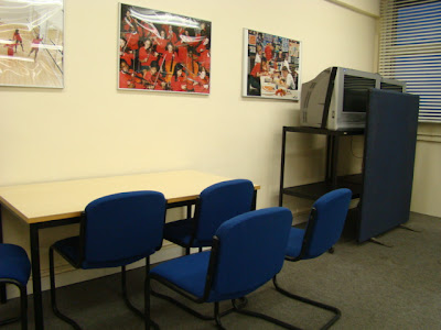
Today i conducted my male model photoshoot in the meeting room on the very top floor of the upper teaching block. I chose to use this specific location in relation to the room having exclusive lighting and therefore i could adjust thel ighting on photoshop is nessessary, which would not affect the original lighting.

I also chose this location due to the background colour. Aiming to have a white backdrop turned out to be useful, as for when i edit my images, i could easily blend the image in with the background colour of the page of my magazine.

Friday, 28 November 2008

Schedule

My scedule for the upcoming week

Editing My Images

Yesterday at CLC i spent the lesson leraning how to mask my images, therefore removing the background. This up coming week i will continue to edit all the photos that i have previously chosen to be issued in my magazine.On Monday, i will conduct my male model photo shoot, as well as proceed with taking an image of myself for my contents page. I will also try to reconstruct the editorial photo of my celebrity, by finding a model who can help me to recreate this image. The decision of recapturing and reconstructing the image of the celebrity was based on the concept that the internet version that i was going to use was far too small to edit out the background precisely and accurately.

This is the image of the celebrity that i was previously going to use before i made changes to my final decision.
Photoshop Instructions

'click' on 'edit in quick mask mode'

Use the brush tool to highlight the image with a red hue. After finished, erase out the sections that are not needed, then 'click' on the 'edit standard mode' and then go to 'select' and 'save selection'.

Tuesday, 25 November 2008

Continuation with the previous photo shoot (what next?) 25/11/08

Another problem that i have come across is finding a replacement male model, due to the previous one backing out, however i have found a new replacement and therefore will arrange a time suitable for him to be able to help conduct my final photo shoot.
All photo shoot images will be used for my double spread of the 'fashion' section in my magazine.

Monday, 24 November 2008

The Photos (Female Model) 24/11/08


I particularly like the additional balloons added to the photo to give it more of a dramatic effect as well as exaggerate the colours of her outfit.


From all the photos taken today, i have chosen a few that i like and think would work best for my double spread. I still have a few more decisions to make, especially if i have chosen two similar photos containing the same outfit.

Model Profile 24/11/08

Today i conducted the photo shoot with my featured female model.


Malalika Carr
When conducting my photo shoot, originally i had thought about and made decisions on asking a friend to help me to create my photos, as she was going to be my main model, however a few changes occured during this process and i was forced to make changes towards my 'fashion' and 'front cover' pages.
At the moment i was able to get hold of my female model but due to a few problems faced, I was unable to gain a few photos of both the male and female models together; however this means that due to my front cover featuring both my male and female models, I will have to find a way of merging the two separate photos together.

Location Shot 24/11/08


Due to lack of spot lights and other equipment, i decided that it would be best to allocate my photo shoot at the top of the upper teaching block, where i had white walls as my backdrop and dimmed lighting to create a dark effective with the contribution to the bright light contrasting from beyond the windows.

Monday, 17 November 2008

Mock Up Advert Of Healthy Eating


I have reviewed other adverts that consists of a main product, and have discover that the use of a white background brings out the colour of the image and draws attention to the image more whereas a colourful background disrupts and distracts the attension of my audience, therefore loosing consentration of the product being suggested to them.

Thursday, 6 November 2008

Monday, 3 November 2008

Mock Up Ideas Of Front Cover Of My Magazine

I have created my first mock up of the way in which i want my presentation of the front cover to appeal to my audience, however when analysing this particular mock up, i was given feedback on the layout of the title of my magazine, it cam to my attention that there was a reson behind why many magazine feature their titles at the top of the page, simply because when advertised on a shelf, the title is less visable to the audience, therefore forcing their eyes to skip the magazine and forcu at another.
Onee again another aspect that was brought to my attention was the 'Hottest Urban Fashion' as my selling line, i was given advice to change this due to the effect of what my magazine represents and is about, therefore i need to think about the following:
  • using a more diversed selling line that suggests to the audience that it is a local, south London magazine, that differs from all other lifestyle magazines.
For this particular front cover i have changed the layout, therefore presenting the title at the bottom of my magazine, however once again, displaying the title at the bottom of my magazine prevents my audience from reviewing the titile, which would mean that i would have to improve the layout of this feature. Although the bold font i have used here for my title of my magazine, creates a straight forward impression.

I like the way in which i have created sections on the front cover for the different topics that will be covered in this magazine.
The black and white image that i have used here is one that i found on the internet specialised for this mock up to gain an idea of what i want my front cover to look like, however i will therefore carry out a photo shoot creating a similar image tothis one, but using teenagers instead, which suggests my target audience. The reason behind the idea of using a male and female model for my front cover, is to simply draw the attention to both genders.
The choice of using a black and white image for my front cover, is an idea that i am happy to continue with, for my final mock up. I think these colours blended together would work well as well as they aralso two colours of which no other magazine have used on their own front cover, which is what makes it all than more appealing because it is different.

Sunday, 19 October 2008

Analysis Of an article featured in Look Magazine


Generic Convention of an Advert (Healthy Eating)


My Next Step?

The next stage that i will be proceeding with, it conducting a mock up photograph of the following aspects that will contribute to my photographs:
  • Equipment that will help enhance the photos e.g. lighting, costume,makeup,hair
  • Positions of my models